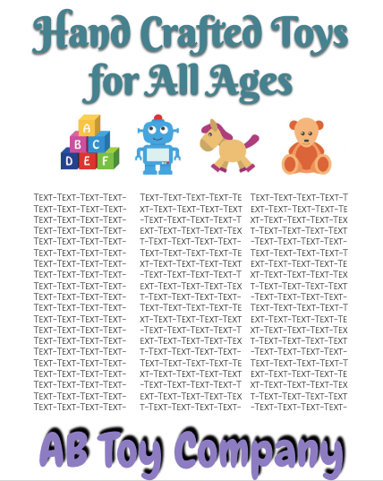
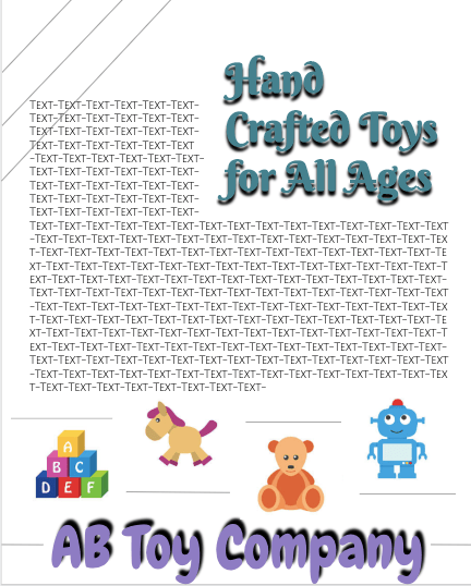
This first design is meant to be more highly structures. All the information appears clearly in line: top to bottom. The design is colorful because it would be targeting children and uses more fun fonts. It is clesn and minimal.This design is meant to be “looser”. While I still implemented balance, the features are more mingled with one another in the design, with more geometric elements added in throughout.

 Rutgers- Web-Based Multimedia Design- Spring 2020 AB