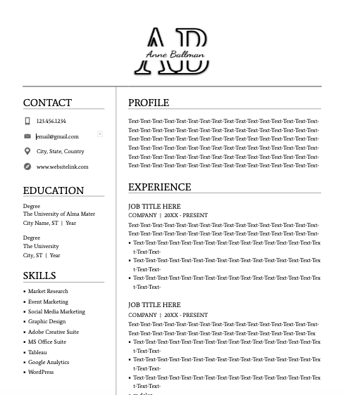
I chose number 3 (logo and resume). I thought this would be helpful because I have been editing my resume to start sending out for positions after graduation, and feel my current resume is plain. I thought this would be a great opportunity to explore new design options. I aimed for my design to be modern-looking and professional so that I could use it as a letterhead. I wanted it to clearly display my name, but inventively and in a way that is eye catching. I started with my logo, which is a clear type font of my initials, interrupted in the middle by my full name written over in a scripted font. In creating the resume format, I tried to maximize space and create a balance on both sides, since some bullet points may end at various points of the page and could create an imbalance if it was all laid out vertically. I chose a clear and professional font for the text.