Be yourself; Everyone else is already taken.
— Oscar Wilde.
This is the first post on my new blog. I’m just getting this new blog going, so stay tuned for more. Subscribe below to get notified when I post new updates.
Be yourself; Everyone else is already taken.
— Oscar Wilde.
This is the first post on my new blog. I’m just getting this new blog going, so stay tuned for more. Subscribe below to get notified when I post new updates.
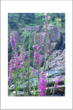
I used this photo from my cropping exercise to test out the border variations. Because the photo has a lot going on, I wanted a minimal border which would increase focus to the photo.
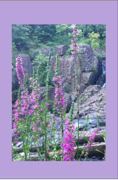
This border is still minimal, but I intended it to complement the colors and subject of the photo. The purple in the border draws more attention to the flowers within the photo and emphasizes the photo’s purpose.
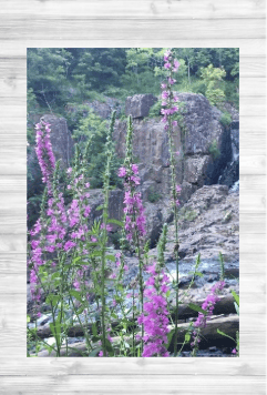
For the final border here, I wanted to include a pattern that would not detract from the photo, but still add texture. I believe the white wood echoes the natural tones in the photo, while still being minimal enough to maintain the aesthetic.
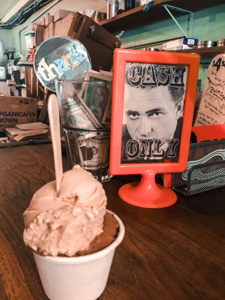
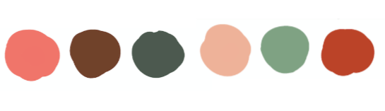
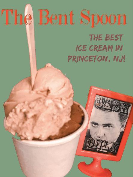
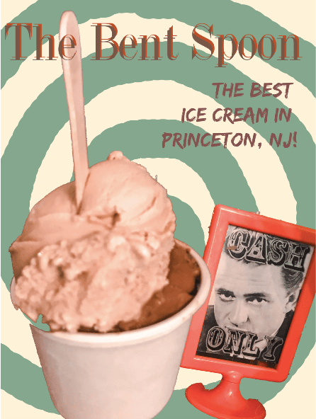
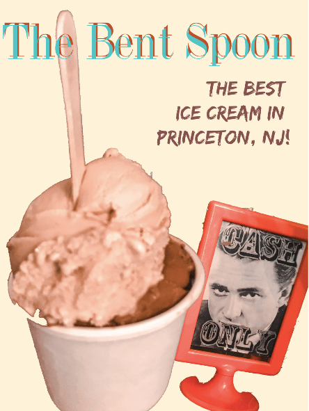
For this activity, I selected a photo I had, formed a color palette, and then played with the color palette to create layout designs featuring aspects of my image. I tried to vary the designs, as was a focus in earlier units, and incorporate colors based in the original photo above. I attempted to pick a mix of bold and muted colors in my final color palette, which I developed through the eye dropper tool. In the designs, I varied different objects within the color palette to maintain balance.
In this activity, I chose six pictures that I have taken to crop, based on the principles learned from Design Basics Index.
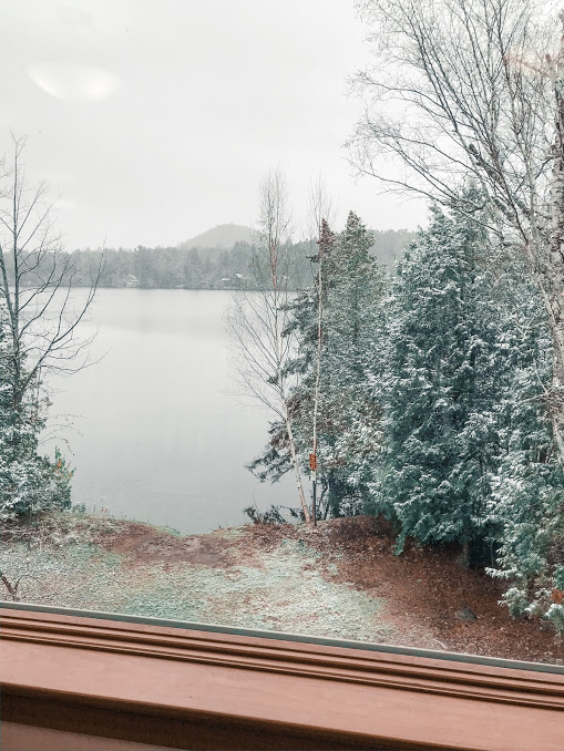
This is the original image of my first crop. I would like to crop it to take the bottom bar out of the photo to increase the focus on the trees and the lake, so that the subject of my photo is more distinct and clear, without distorting the image or making it look too zoomed in. The ledge is currently “unnecessary”.
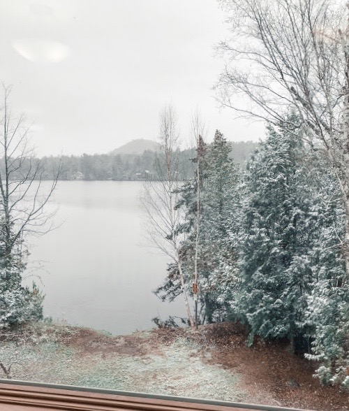
I ultimately cropped out most of the bottom ledge, but liked having a bit of it in to show perspective.
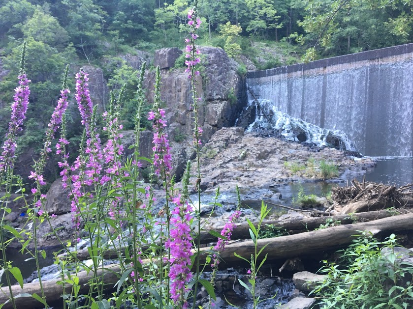
I would like to crop this image to a more zoned in focus, it comes off very busy as is, and it is unclear where in the photo the eye should be drawn.
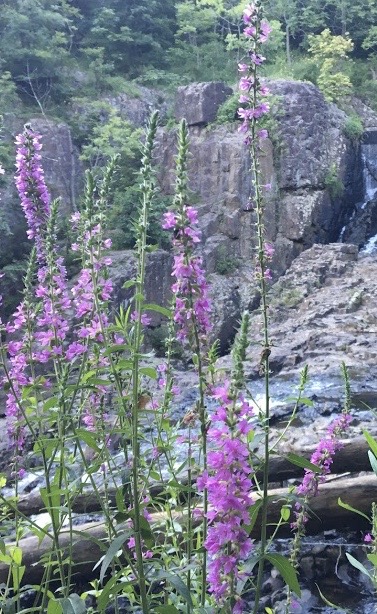
This is a relatively drastic crop, but I believe that the crop allows the focus of the photo to shift, and allows the photo to be used in a design more flexibly, as it is not as busy and doesn’t have several focus points in one image.
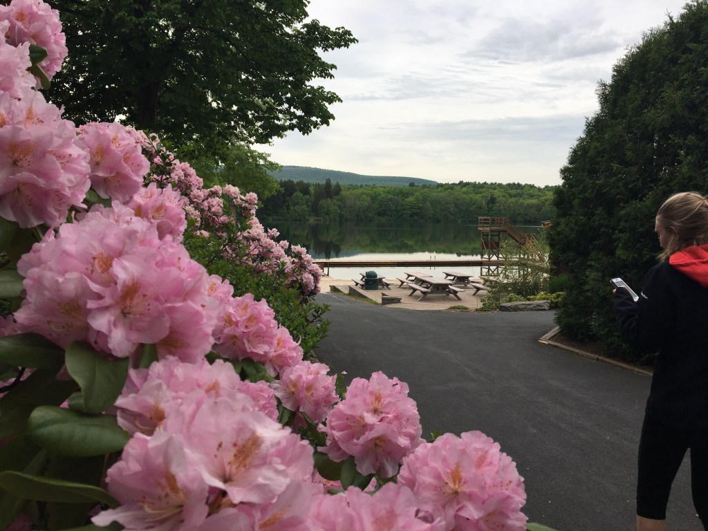
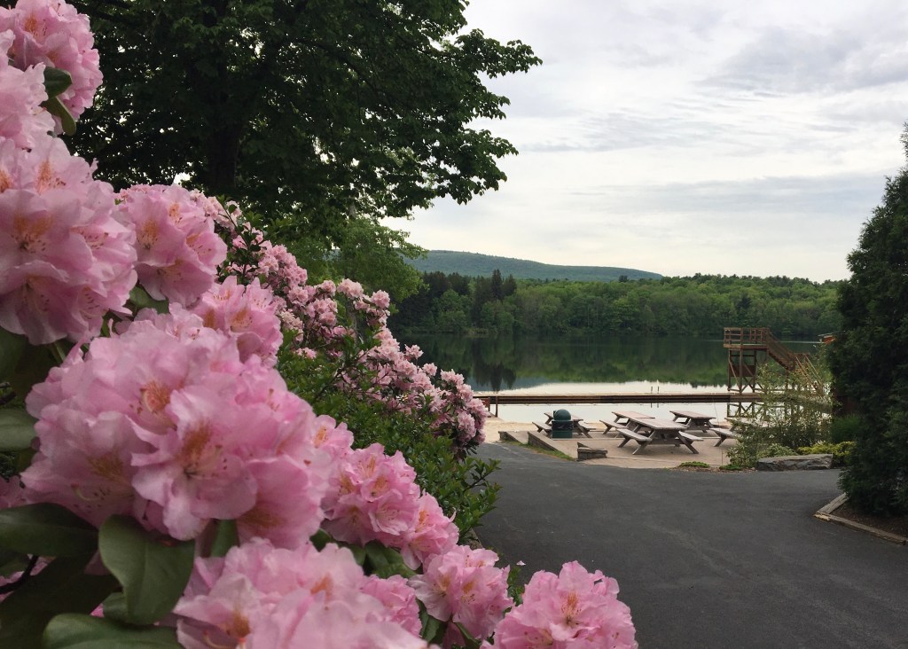
Another photo of scenery with flowers in the foreground! I’m realizing I have a lot of photos like this…
I wanted to crop this image to make it more aesthetically pleasing, and crop out the person walking. Additionally, I would like to see the flowers more on the edge of the photo as a border so they are not in the way of the landscape.
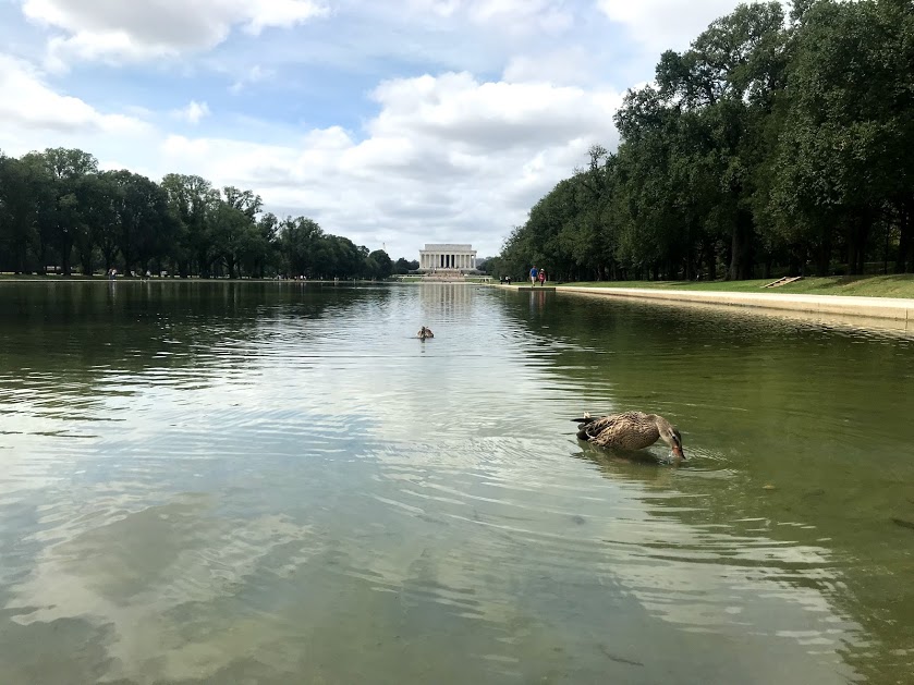
All of the subjects within this photo are very small, and I will ideally crop it to bring one subject to the foreground of the photo.
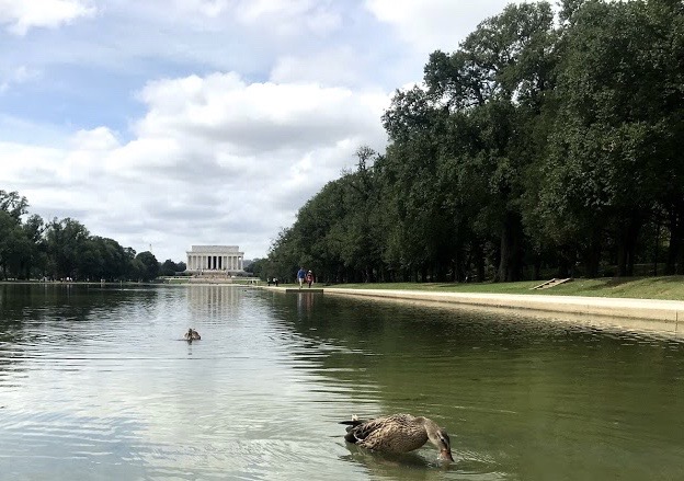
In the final image, the crop allows the duck to become the centerpiece of the photo, with other subjects in the background to complement the image.
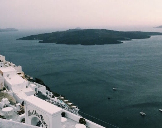
Again with the ledge!
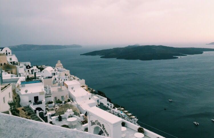
To crop this photo, I’d like to take out the “unnecessary” ledge and center the volcano in the back of the photo, putting the buildings on the left and the boats on the right to complement the background in a balance, and make it more aesthetically pleasing.
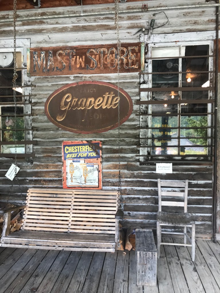
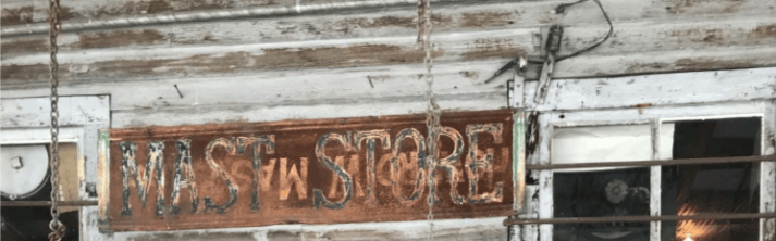
I like this image as it is, but I would like to try a crop similar to the example in the book, zoning in on one small piece of an image with many eye catching points, essentially creating a very different image. I mostly have done photos of scenery so far, so I wanted to test out something like this as well.
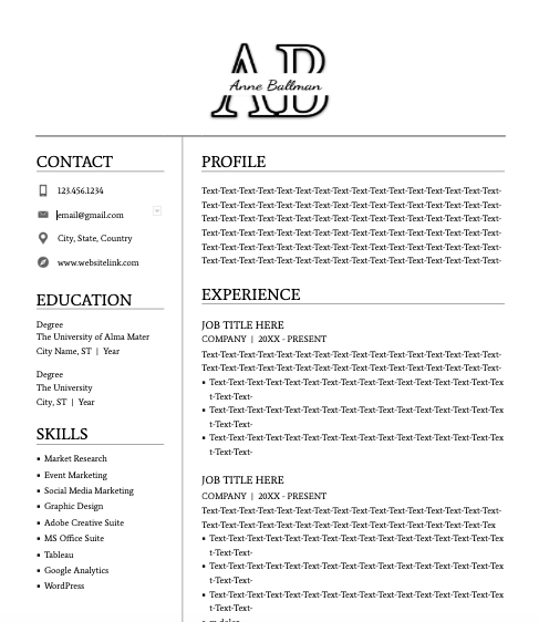
I chose number 3 (logo and resume). I thought this would be helpful because I have been editing my resume to start sending out for positions after graduation, and feel my current resume is plain. I thought this would be a great opportunity to explore new design options. I aimed for my design to be modern-looking and professional so that I could use it as a letterhead. I wanted it to clearly display my name, but inventively and in a way that is eye catching. I started with my logo, which is a clear type font of my initials, interrupted in the middle by my full name written over in a scripted font. In creating the resume format, I tried to maximize space and create a balance on both sides, since some bullet points may end at various points of the page and could create an imbalance if it was all laid out vertically. I chose a clear and professional font for the text.
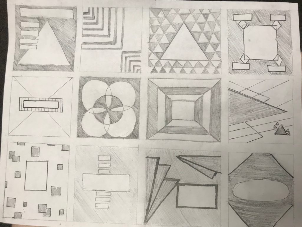
On pg 143, the prompt asks us to design a logo for a variety of companies, first through a sketch, and then in a digital graphic. I chose to make a logo for a financial company. Initially, I based these sketches on shapes which I believed would convey the aim of the company and based the design around those. I included several variations of these shapes in logo ideas, and then I used design skills from this module in varied ways through the designs presented (shading, balance, composition).
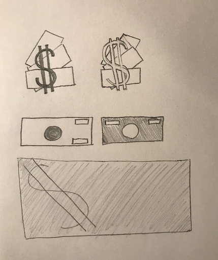
Ultimately, I decided on the top two sketches to transfer to a digital design. In my digital design, I included a color palette and drop shadow to make it more aesthetically pleasing.

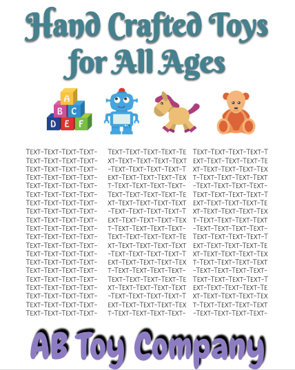
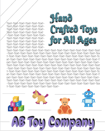
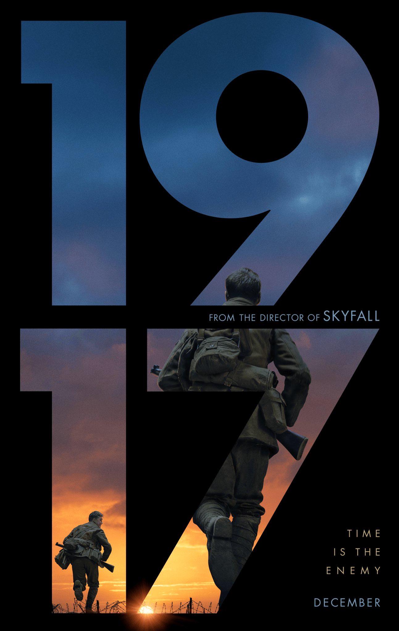
For Part I of our Mini-Art School assignment, we are asked to analyze a piece of graphic design against the rules of design we have learned from a variety of sources. For my design example, I chose to analyze the “1917” movie poster, in honor of my pick for “Best Picture” at tonight’s Academy Awards. This movie poster is one of several made for this film, but this qualifies as the official promotional poster. Based on the rules we have learned about regarding design,
This is an example post, originally published as part of Blogging University. Enroll in one of our ten programs, and start your blog right.
You’re going to publish a post today. Don’t worry about how your blog looks. Don’t worry if you haven’t given it a name yet, or you’re feeling overwhelmed. Just click the “New Post” button, and tell us why you’re here.
Why do this?
The post can be short or long, a personal intro to your life or a bloggy mission statement, a manifesto for the future or a simple outline of your the types of things you hope to publish.
To help you get started, here are a few questions:
You’re not locked into any of this; one of the wonderful things about blogs is how they constantly evolve as we learn, grow, and interact with one another — but it’s good to know where and why you started, and articulating your goals may just give you a few other post ideas.
Can’t think how to get started? Just write the first thing that pops into your head. Anne Lamott, author of a book on writing we love, says that you need to give yourself permission to write a “crappy first draft”. Anne makes a great point — just start writing, and worry about editing it later.
When you’re ready to publish, give your post three to five tags that describe your blog’s focus — writing, photography, fiction, parenting, food, cars, movies, sports, whatever. These tags will help others who care about your topics find you in the Reader. Make sure one of the tags is “zerotohero,” so other new bloggers can find you, too.

 Rutgers- Web-Based Multimedia Design- Spring 2020 AB